Case Study

BuzzWallet

Redefining the BuzzCard Experience.

DURATION

Jan. 2023 - Apr. 2023

ROLE

Product Designer, User Testing

TEAM

Self, Mark Benedict Agunias

TOOLS

Figma, Figjam

Case Study

BuzzWallet

Redefining the BuzzCard Experience.

DURATION

Jan. 2023 - Apr. 2023

ROLE

Product Designer, User Testing

TEAM

Self, Mark Benedict Agunias

TOOLS

Figma, Figjam

Case Study

BuzzWallet

Redefining the BuzzCard Experience.

DURATION

Jan. 2023 - Apr. 2023

ROLE

Product Designer, User Testing

TEAM

Self, Mark Benedict Agunias

TOOLS

Figma, Figjam

01. Background

Project Overview and Context

CONTEXT

Background

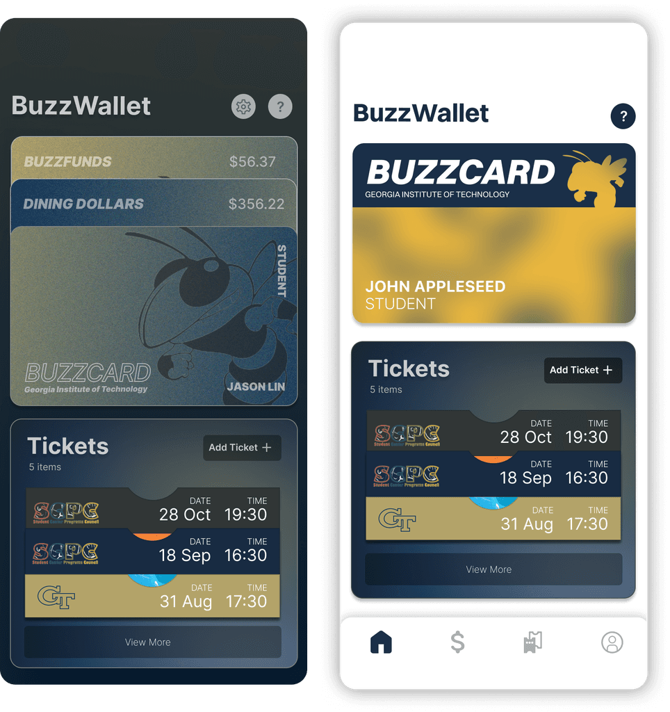
BuzzWallet is an app my partner, Mark Benedict Agunias, and I developed during the Bits of Good design bootcamp at Georgia Tech in early 2023.

The app digitizes the Buzzcard (student ID), enhances campus event accessibility, and allows reloading money to campus accounts. I focused on app design and prototyping, while Mark handled branding, graphics, and UI design. Together, we built an app to simplify campus life for Georgia Tech students.

CONTEXT

What is a BuzzCard?

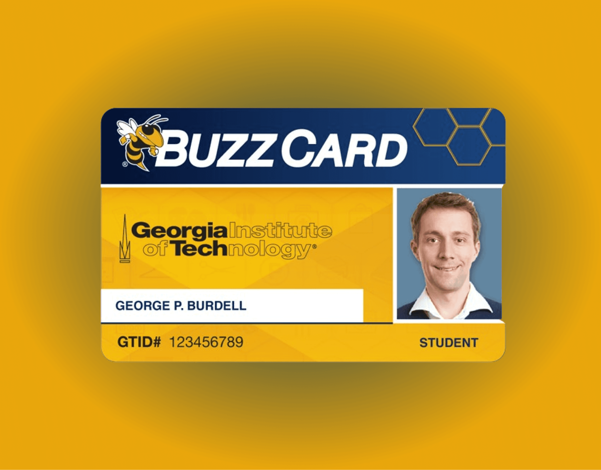
The Georgia Tech BuzzCard is a multifunctional ID card used by students and faculty. It grants access to various campus facilities, including libraries, labs, and dormitories, ensuring secure and convenient entry for authorized individuals.

In addition to providing access, the BuzzCard serves as a payment method for dining and other on-campus services. It also allows users to manage their funds through the BuzzFunds system, making it a versatile and essential tool for campus life.

PROBLEM AND SOLUTION

The Problem

  • There's no digital version of the BuzzCard. At Georgia Tech, students rely on the BuzzCard for various essential activities, such as accessing buildings and paying for meals. This absence of a digital option causes significant issues when students forget or lose their physical BuzzCard.


  • Getting tickets for campus events is a hassle because students have to search through their emails to find them.


  • BuzzFunds and Dining Dollars are hard to access and reload, so students often avoid using them.

The lack of user-friendly options limits the BuzzCard's effectiveness.

The lack of user-friendly options limits the BuzzCard's effectiveness.

The lack of user-friendly options limits the BuzzCard's effectiveness.

PROBLEM AND SOLUTION

The Solution

  • A virtual BuzzCard: Access buildings and make payments effortlessly with your phone.


  • An event ticket manager: Find and organize all your campus event tickets in one place.


  • A fund manager: Check and reload your BuzzFunds and Dining Dollars with ease.

02. Research

Research Methods and Design Goals

RESEARCH METHODS

Survey + Affinity Diagram

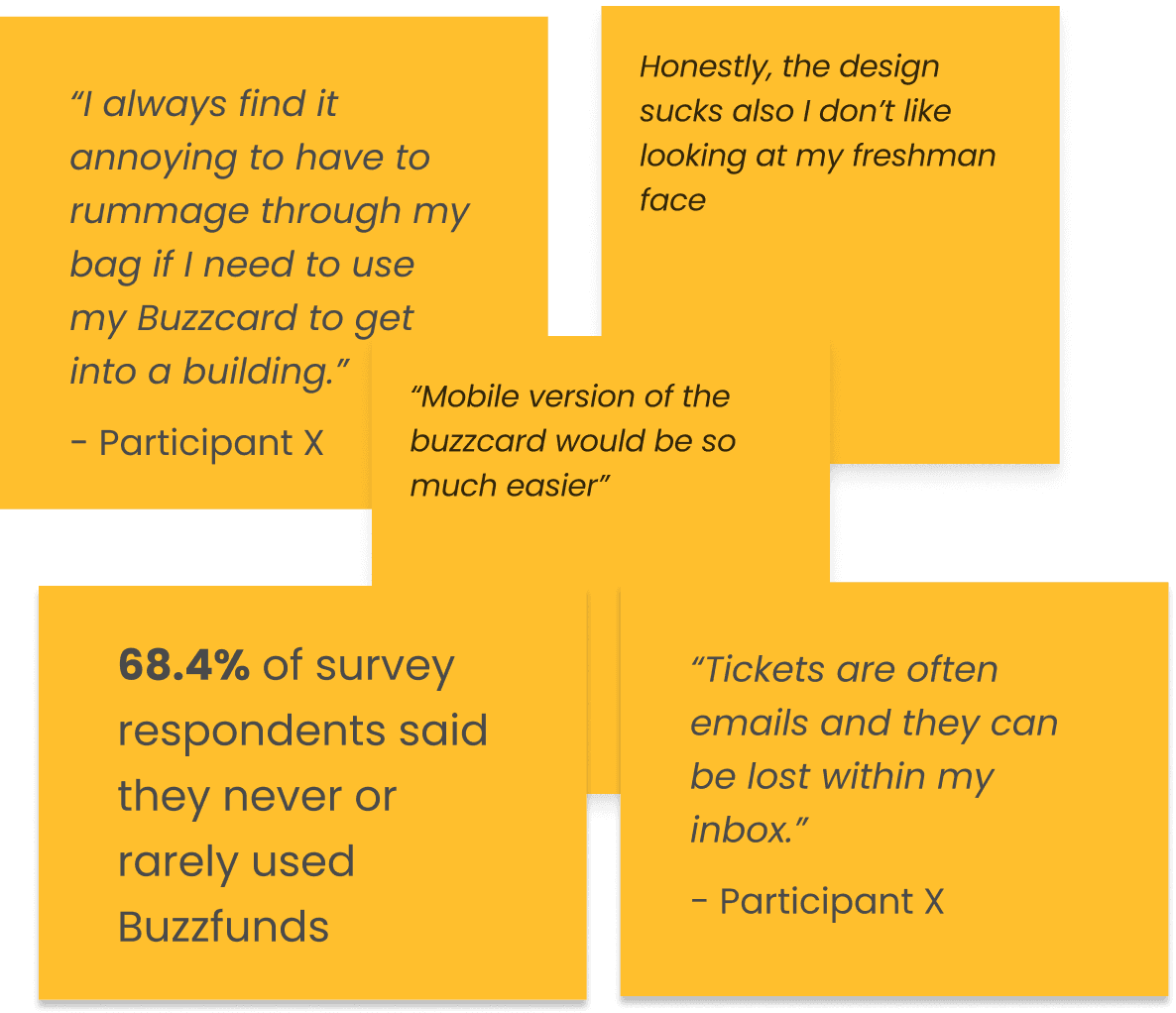
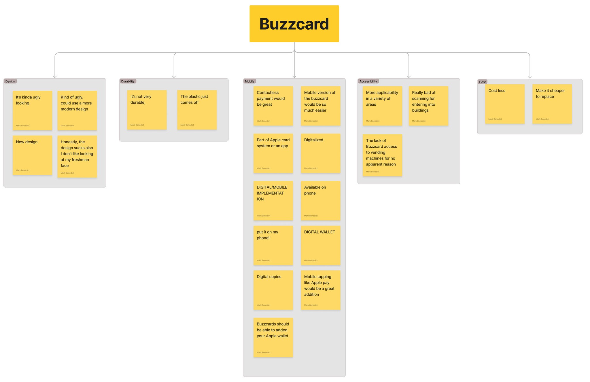
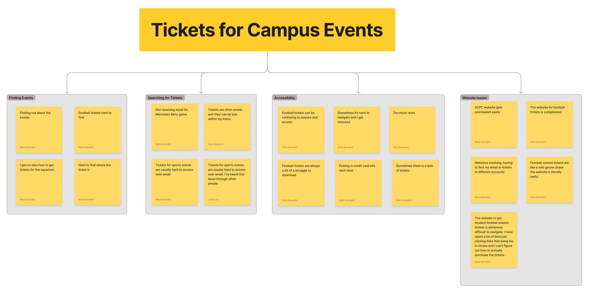
To understand how students use their Buzzcard, access event tickets, and manage Buzzfunds, we conducted a Qualtrics survey in February 2023. We received responses from 73 students and conducted detailed interviews with seven, representing different majors and living situations. The insights from these surveys and interviews guided improvements to the BuzzWallet app, ensuring it better met students' needs. We then categorized these pain points into the affinity diagram below.

*Click Diagrams to Enlarge

To understand how students use their Buzzcard, access event tickets, and manage Buzzfunds, we conducted a Qualtrics survey in February 2023. We received responses from 73 students and conducted detailed interviews with seven, representing different majors and living situations. The insights from these surveys and interviews guided improvements to the BuzzWallet app, ensuring it better met students' needs. We then categorized these pain points into the affinity diagram below.

*Tap Diagrams to Enlarge

APPLYING RESEARCH

Key Findings

Students want a new, mobile Buzzcard

“Mobile version of the buzzcard

would be so much easier”

“Mobile version of the buzzcard would be so much easier”

“Put it on my phone!!”

"Mobile tapping like Apple Pay

would be a great addition!"

"Mobile tapping like Apple Pay would be a great addition!"

Georgia Tech Funds are difficult to Access

“I never know where to load funds to my BuzzCard”

“I keep forgetting to bring my BuzzCard with me so I never really get to use my BuzzFunds”


Georgia Tech Funds are difficult to Access

“I never know where to load funds to my BuzzCard”

“I keep forgetting to bring my BuzzCard with me so I never really get to use my BuzzFunds”


Campus events need to be more accessible

“Tickets are often in emails and they can be lost within my inbox.

Football season tickets are like a wild goose chase the website is literally awful

Campus events need to be more accessible

“Tickets are often in emails and they can be lost within my inbox.

Football season tickets are like a wild goose chase the website is literally awful

Students want a new, mobile Buzzcard

Georgia Tech Funds are difficult to Access

Campus events need to be more accessible

APPLYING RESEARCH

User Personas

From our interviews/surveys we were able to come up with two user personas that reflected our user groups.

Troy

4th Year

Architecture major

Lives Off Campus

Troy is a 4th year architecture major that lives off-campus. He typically finds himself at the studio late at night. One night while walking from his apartment to the studio, he realizes he forgot his Buzzcard which he needs to have in order to get into studio.

Melissa

1st Year

Computer Science Major

Lives on-campus

Melissa is a 1st year computer science major that lives on-campus. Melissa is an avid football fan. Before the first game of the new season, she realizes she doesn’t have her tickets ready. She steps out of line to find her tickets, scrolling endlessly to find the email with them in it.

APPLYING RESEARCH

User Flows

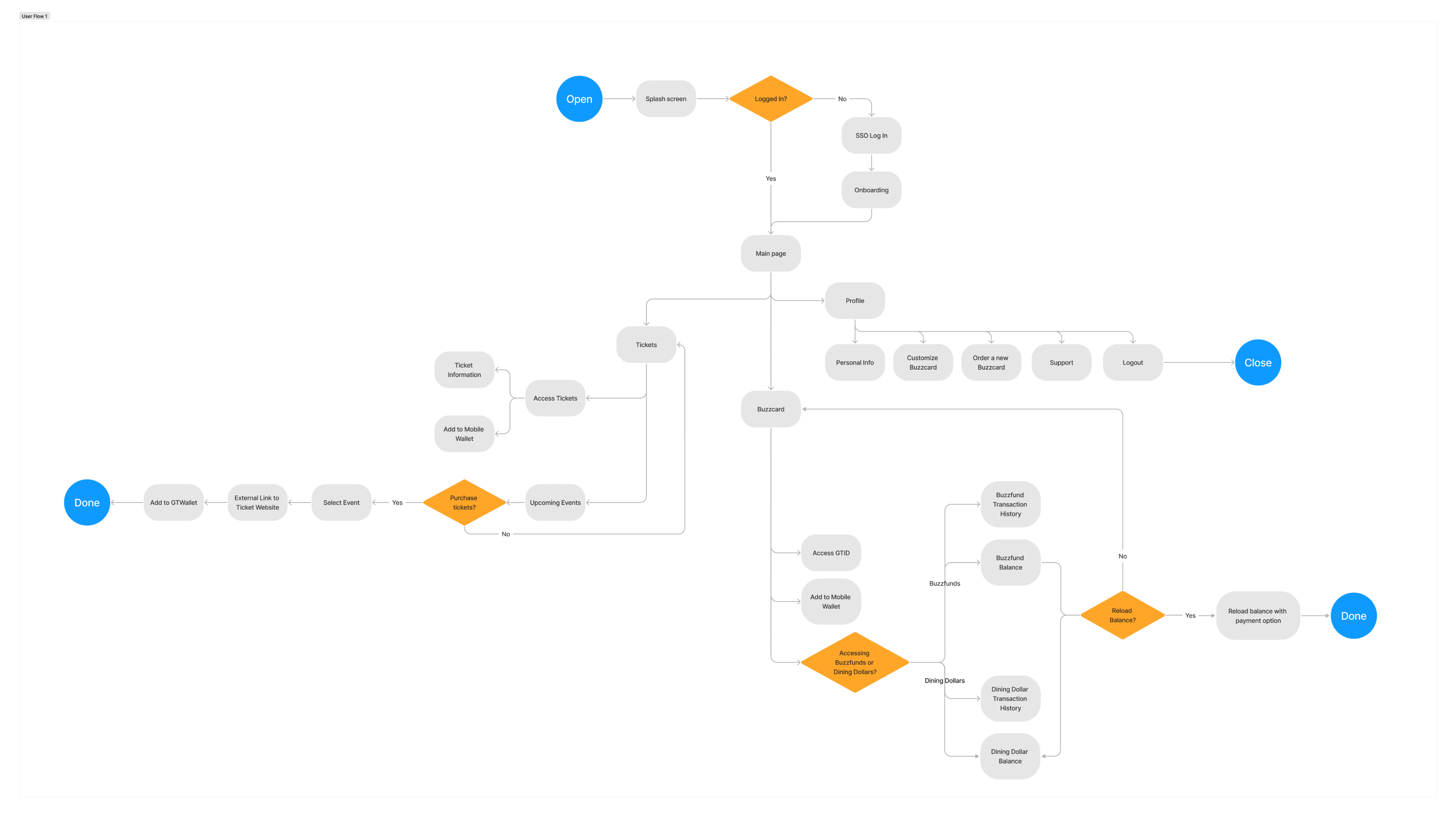
After we created the personas we then mapped a user flow linking the digital BuzzCard, BuzzFunds, and campus tickets.

*Click Diagram to Enlarge

APPLYING RESEARCH

Design Goals

After our research, user personas, and user flow construction, we set three design goals for the solution's design:

  1. Digitize the BuzzCard

  1. Create an easy-to-access way for managing campus funds

  1. Design a hub for viewing and retrieving campus event tickets

03. Iteration

Wireframes and User Testing

WIREFRAMES

Low Fidelity

The initial lo-fi wireframes combined some of our ideas but lacked a nav bar, which changed in the hi-fi version. This version took inspiration from Apple Wallet in structure, as the Buzzfunds/Dining dollars were structured similarly to Apple Cash.

*Click Wireframe to Enlarge

The initial lo-fi wireframes combined some of our ideas but lacked a nav bar, which changed in the hi-fi version. This version took inspiration from Apple Wallet in structure, as the Buzzfunds/Dining dollars were structured similarly to Apple Cash.

*Tap Wireframe to Enlarge

The initial lo-fi wireframes combined some of our ideas but lacked a nav bar, which changed in the hi-fi version. This version took inspiration from Apple Wallet in structure, as the Buzzfunds/Dining dollars were structured similarly to Apple Cash.

*Tap Wireframe to Enlarge

WIREFRAMES

Mid Fidelity

I had a lot of time during this period, so I took it upon myself to improve my UI design and experiment with prototyping. This effort made the mid-fi prototypes look pretty hi-fi. Creating these prototypes helped me vastly improve using Figma as I became more comfortable with the software. You can view the prototype in action here.

*Click Wireframe to Enlarge

The initial lo-fi wireframes combined some of our ideas but lacked a nav bar, which changed in the hi-fi version. This version took inspiration from Apple Wallet in structure, as the Buzzfunds/Dining dollars were structured similarly to Apple Cash.

*Tap Wireframe to Enlarge

The initial lo-fi wireframes combined some of our ideas but lacked a nav bar, which changed in the hi-fi version. This version took inspiration from Apple Wallet in structure, as the Buzzfunds/Dining dollars were structured similarly to Apple Cash.

*Tap Wireframe to Enlarge

USABLITY TESTING

Usability Testing Results

After creating our wireframes, we conducted usability testing with four participants in an interview-style format. The participants were asked to reload their dining dollars balance and add a Georgia Tech football ticket to their Apple Wallet. These tasks provided valuable insights, helping us identify areas for improvement in our app design. From this testing, we derived three key insights to enhance our hi-fi prototype:

USABLITY TESTING

01 Keeping the Ticket Hub

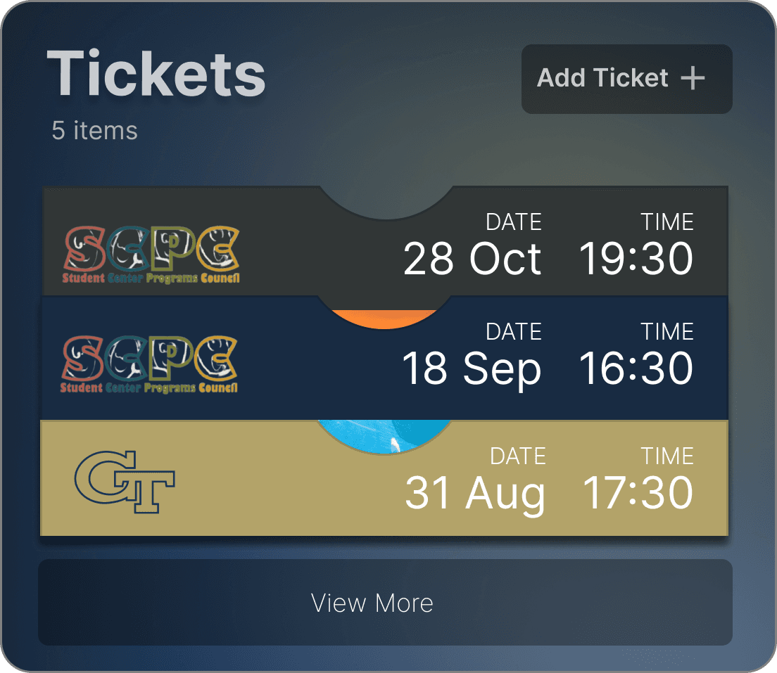
We kept the ticket hub for easy access to tickets without switching pages. Users can search, add, and retrieve tickets from the home screen, simplifying the user experience. This centralized approach enhances usability and ensures quick, efficient ticket management, leading to a smoother and more satisfying experience.

USABILITY TESTING

02 Adding a Navigation Bar

We chose to add a navigation bar for more streamlined navigation, allowing users to easily access other pages without losing their place. This improves the user experience by providing a consistent, intuitive way to move through the app.

USABILITY TESTING

03 Flattening the Design

Based on user feedback, we transitioned to a white base color to better fit WCAG standards. This change improved the app's readability and accessibility, ensuring sufficient contrast for all users, including those with visual impairments. Adhering to these guidelines aimed to provide a more inclusive user experience, making the app more user-friendly and accessible to a wider audience.

BuzzWallet

?

USABLITY TESTING

02 Adding a Navigation Bar

We chose to add a navigation bar for more streamlined navigation, allowing users to easily access other pages without losing their place. This improves the user experience by providing a consistent, intuitive way to move through the app.

USABLITY TESTING

03 Flattening the Design

Based on user feedback, we transitioned to a white base color to better fit WCAG standards. This change improved the app's readability and accessibility, ensuring sufficient contrast for all users, including those with visual impairments. Adhering to these guidelines aimed to provide a more inclusive user experience, making the app more user-friendly and accessible to a wider audience.

USABLITY TESTING

01 Keeping the Ticket Hub

We kept the ticket hub for easy access to tickets without switching pages. Users can search, add, and retrieve tickets from the home screen, simplifying the user experience. This centralized approach enhances usability and ensures quick, efficient ticket management, leading to a smoother and more satisfying experience.

USABLITY TESTING

03 Flattening the Design

Based on user feedback, we transitioned to a white base color to better fit WCAG standards. This change improved the app's readability and accessibility, ensuring sufficient contrast for all users, including those with visual impairments. Adhering to these guidelines aimed to provide a more inclusive user experience, making the app more user-friendly and accessible to a wider audience.

USABLITY TESTING

02 Adding a Navigation Bar

We chose to add a navigation bar for more streamlined navigation, allowing users to easily access other pages without losing their place. This improves the user experience by providing a consistent, intuitive way to move through the app.

04. Designs

Branding and Final Hi-Fi Prototypes

BRANDING

Style Guide

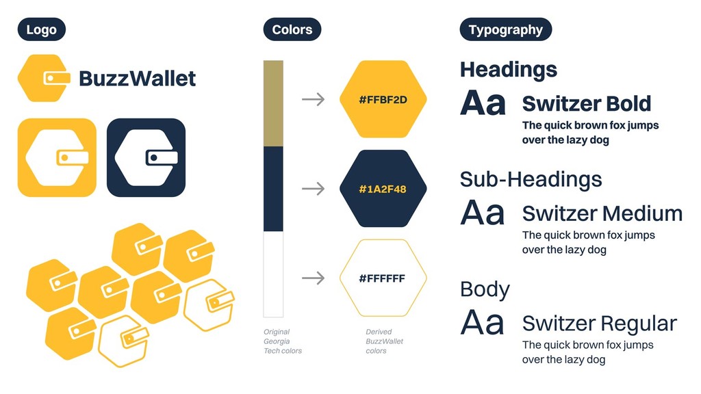
While I focused on prototyping, Mark developed the branding theme for our hi-fi mockup. I really appreciate his work; it's simple and direct. The logo features a honeycomb with a wallet component, which I thought was a clever touch. The visual identity is intended to be a modernized version of Georgia Tech's motifs and color palettes.

*Click Style Guide to Enlarge
Style

Color

Style

Color

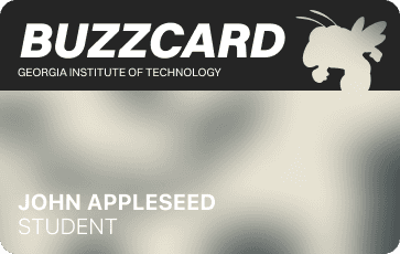
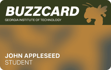
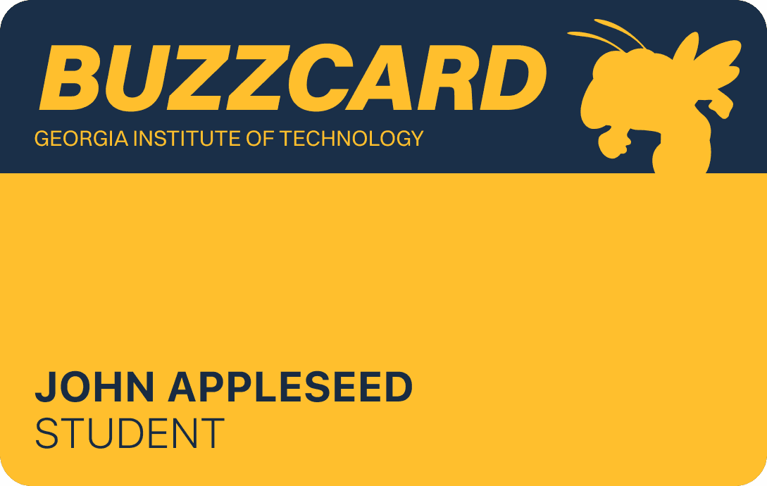
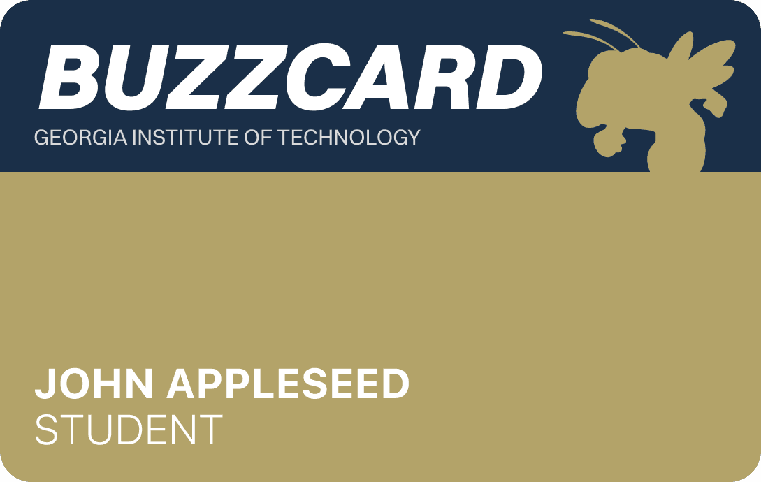
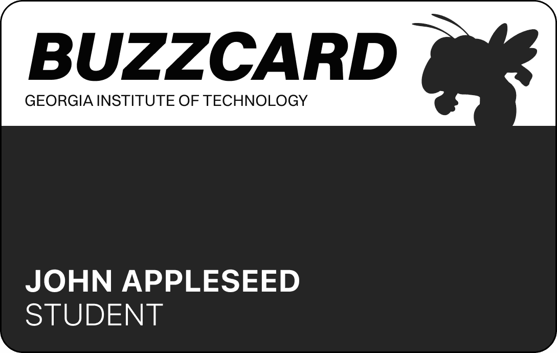
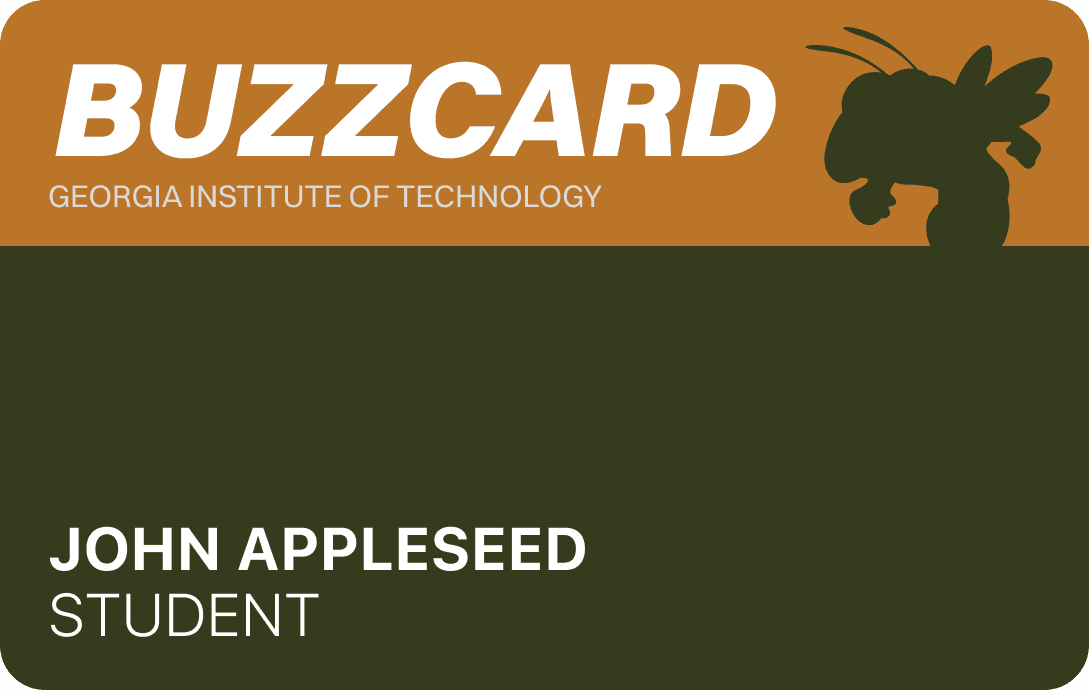
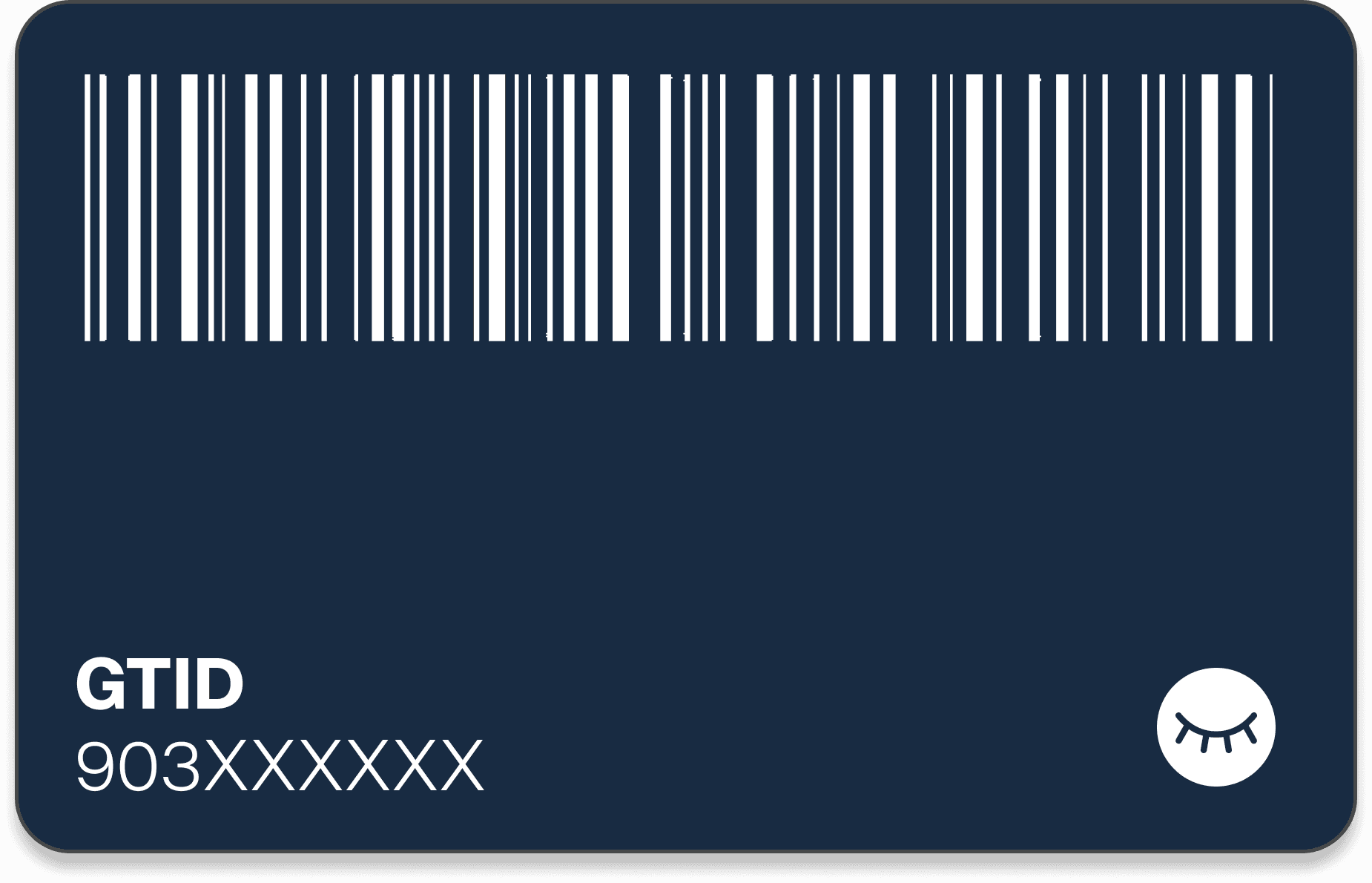
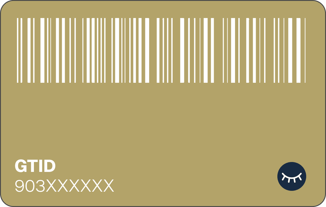
BUZZCARD REDESIGN

BuzzCard Reimagined

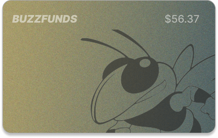
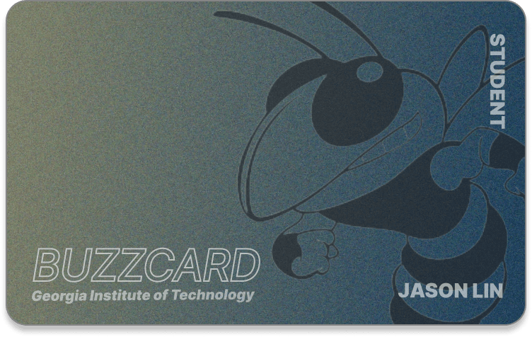
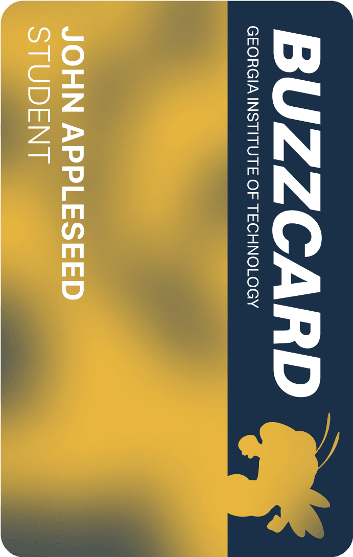
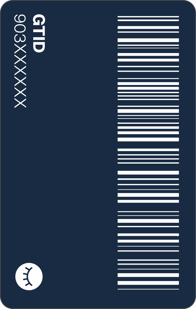
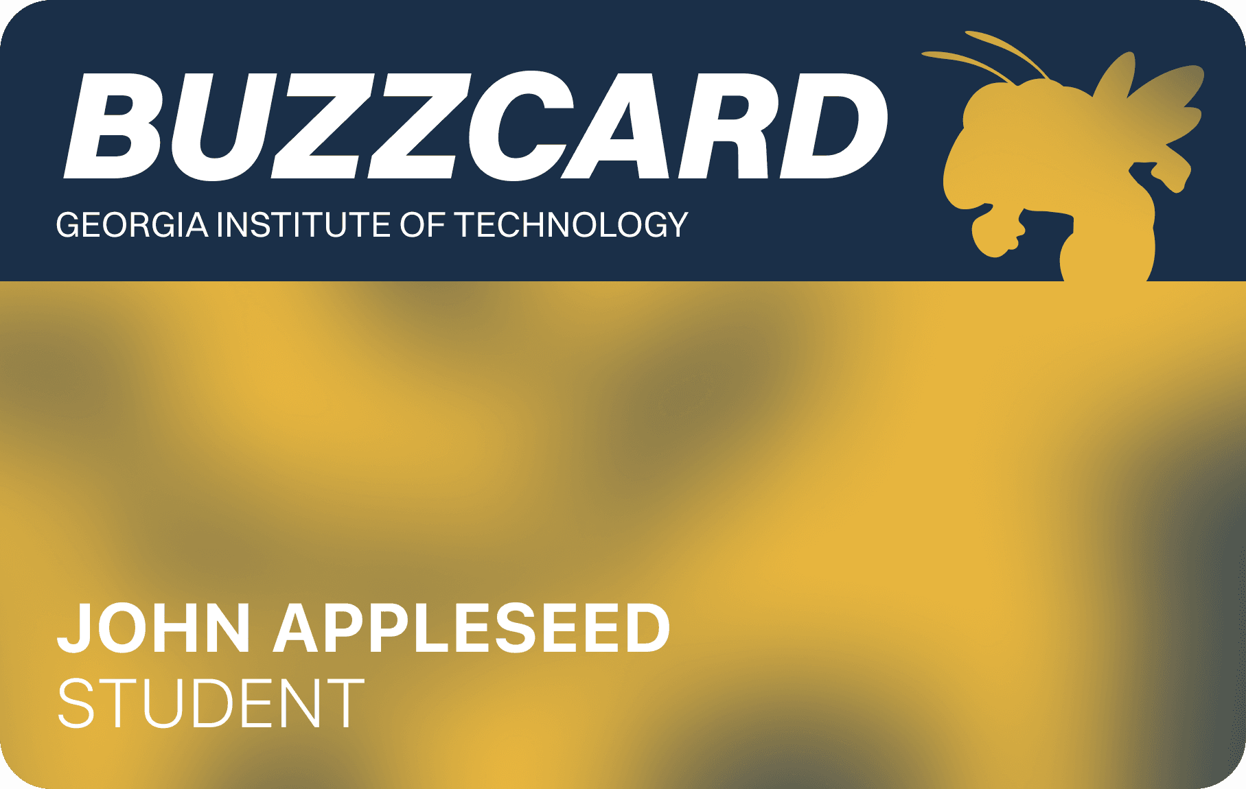
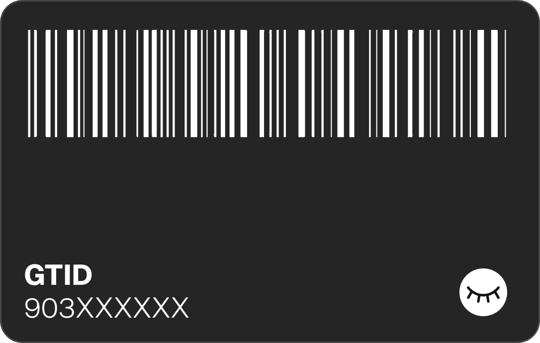
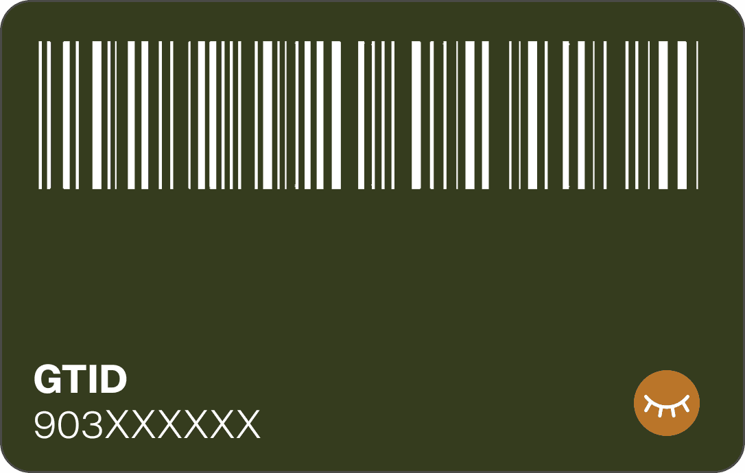
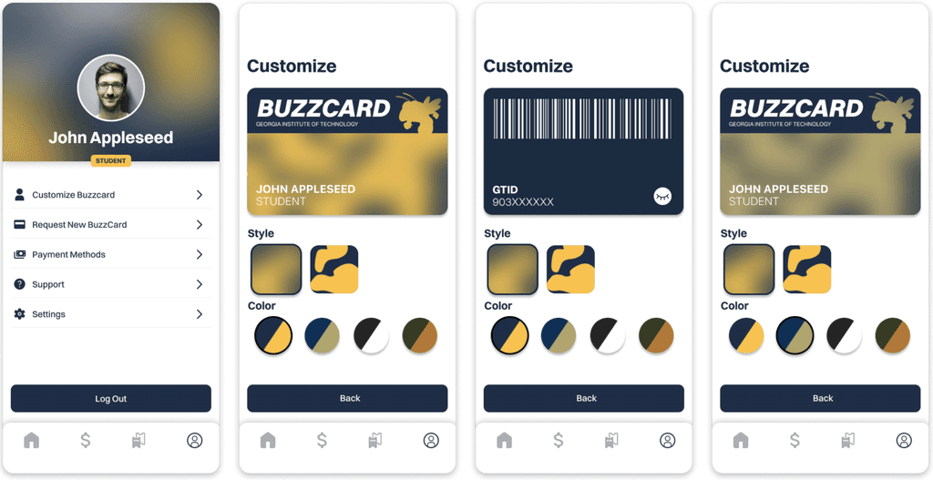
A modern take on the Georgia Tech BuzzCard focused on minimalist gradient-based designs. With 8 distinct styles, it is meant to be customizable to address user pain points about the current poor BuzzCard design.

Customize

Click me!

BUZZWALLET FEATURES

Digital BuzzCard

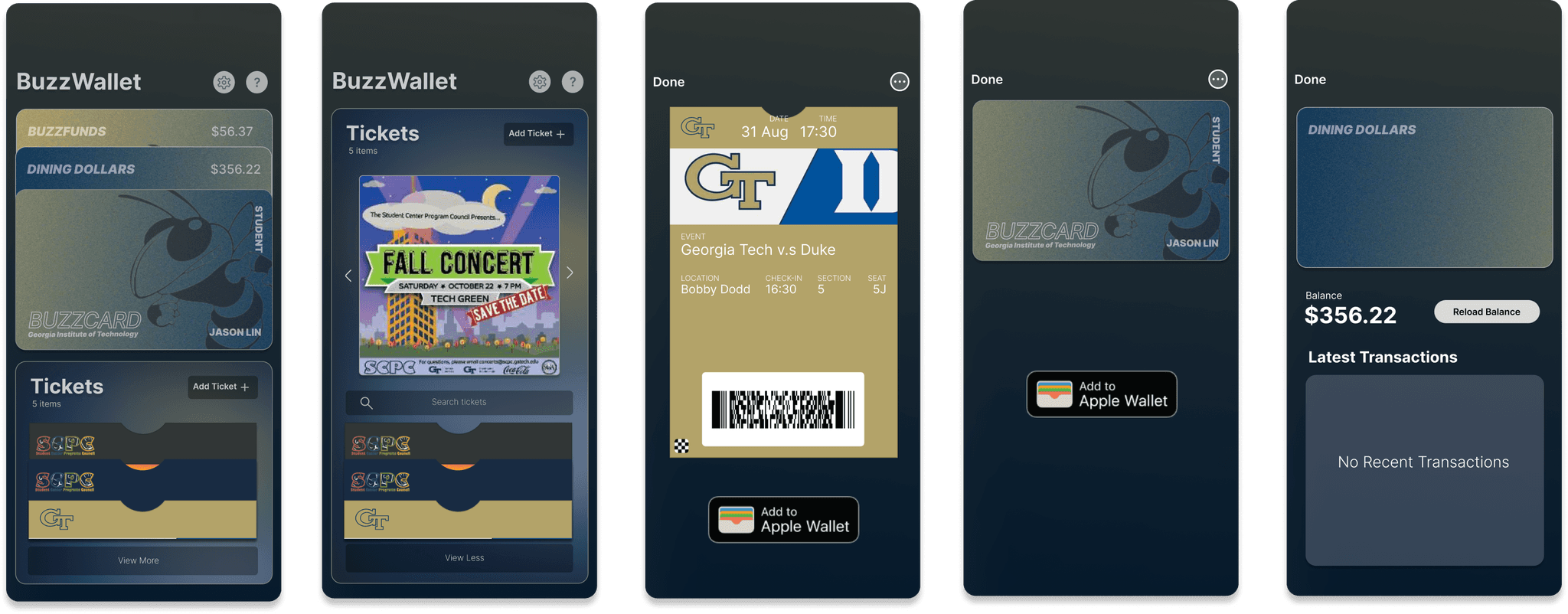
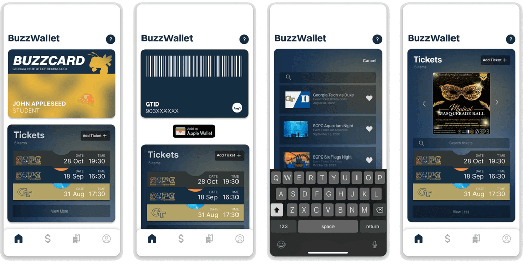
The hi-fi version of BuzzWallet retains many elements from the mid-fi version, including the flipping card and the quick ticket menu. This version also features the "Add to Apple Wallet" functionality with a pop-up animation. I had a lot of fun prototyping it to make it as realistic as possible.

BUZZWALLET FEATURES

Tickets Made Quick

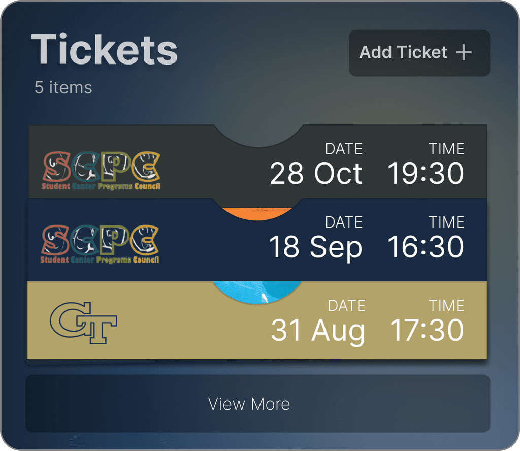
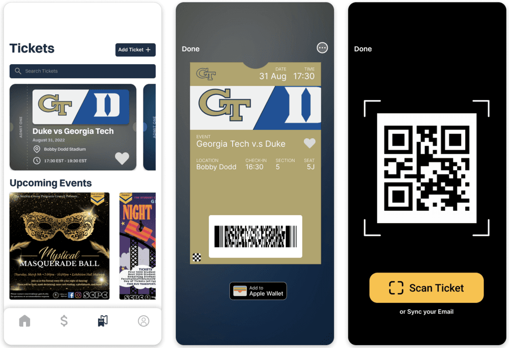
Easily access your latest events with the quick ticket pop-up. Your favorited tickets will appear in the bank. You can search for recent events and scan your tickets via email or scanner with ease. Tickets also feature an "Add to Apple Wallet" animation.

BUZZWALLET FEATURES

Reloading Simplified

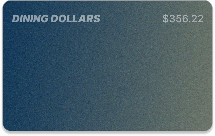
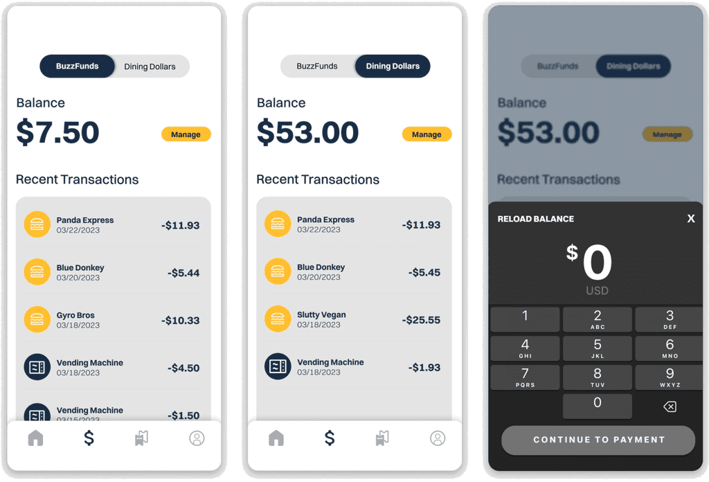
Easily reload your BuzzFunds and Dining Dollars. The nav-bar in the hi-fi version allows both to be reloaded on a single page. You can also view your recent transactions.

BUZZWALLET FEATURES

Events Made Easy

In addition to the quick ticket screen, we also created a separate page dedicated for events. Here, you can scroll and search through your tickets and view upcoming events on campus.

FINAL DESIGNS

Hi-Fi Complete Designs

*Click Diagrams to Enlarge

Onboarding
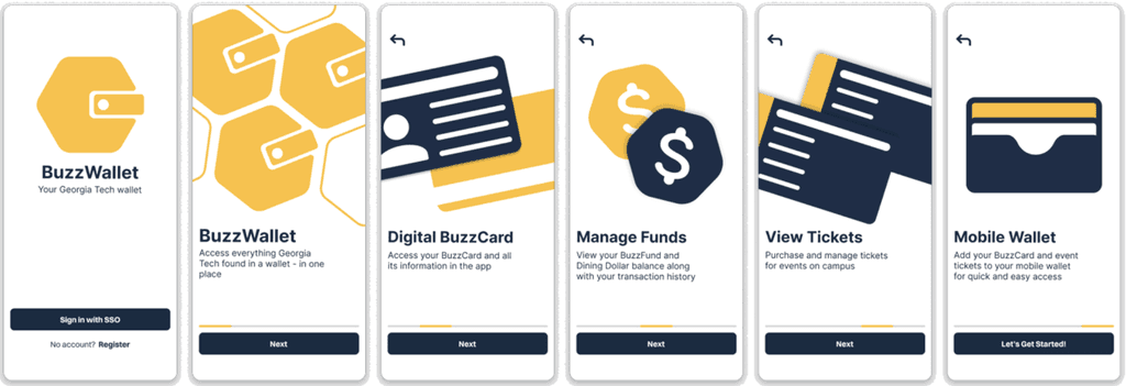
Home Screen
Funds
Tickets
Profile
05. Takeaways

Project Reflection and Live Prototype

REFLECTION

Key Takeaways

  1. Using Figma and Prototyping: This case study was my first time fully prototyping an app, and I'm excited by how much I've grown with Figma. I've become confident in animating my ideas, and I've found that prototyping is one of the most enjoyable and rewarding parts of the design process for me.


  2. Experience in User Research: Working on the BuzzWallet project taught me the importance of user research in design. We wanted to create an app that met the needs of Georgia Tech students, so we started by conducting surveys and interviews. Talking with students helped us understand their experiences with Buzzcards, event tickets, and Buzzfunds. Their feedback guided our design choices and helped us improve the app.


  3. Collaborative Work: Working with a partner who had a different design style was a rewarding experience. We combined our unique approaches to create an appealing app. Through effective communication and embracing each other's ideas, we found a balance between our styles. This collaboration enriched the final product and showed me the importance of valuing diverse perspectives in design.
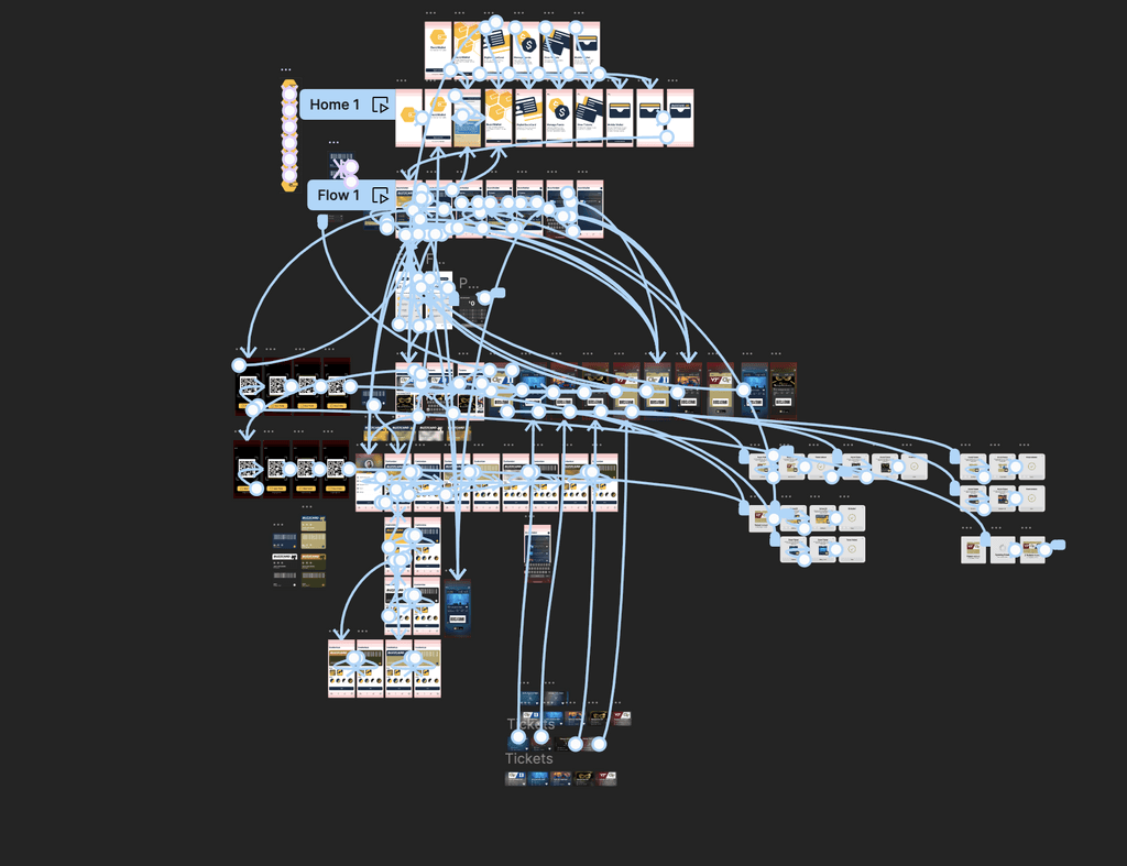
Lots of Lots of Prototyping!

REFLECTION

Final Thoughts and Reflections

BuzzWallet was my first in-depth UX case study and my first time using Figma. Before this bootcamp, I dabbled in UX but never took it seriously. As a CS Student at Georgia Tech, I initially didn’t know what to expect. I couldn't see myself as a software developer, but this bootcamp helped me realize my true passion for design. Working on this long-term project developed my newfound passion for the field. I am incredibly thankful for my instructors Karis, Sun, and Joyce for guiding me on this journey, and especially my partner Mark, who ensured the product was well executed.

BuzzWallet

Your Georgia Tech Wallet.

Try Now

Fitzi

Tech Eats
BuzzWallet